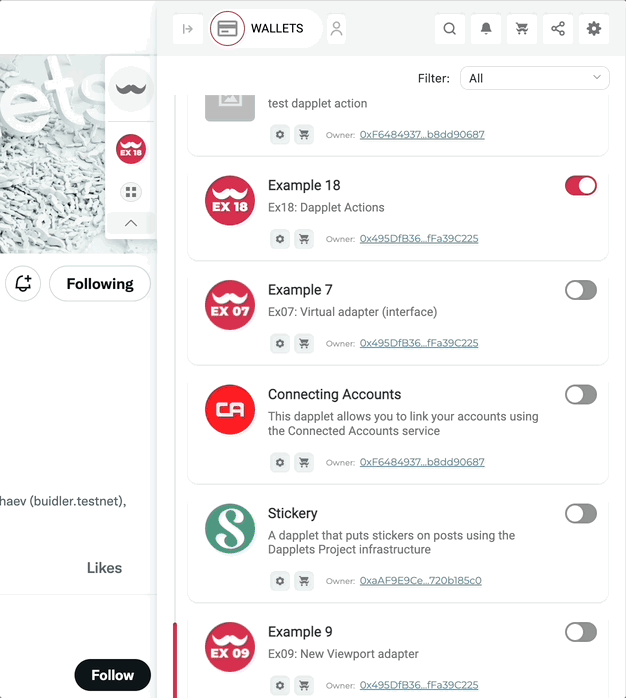
Dapplet Actions
Dapplet Actions widgets are used for quick user access to dapplet functions in a minimized Extension view.
The initial code for this example is in master.
- Open
src/index.ts. Add the Overlay adapter in addition to the context adapter.
- Import widget button as
buttonActionfrom Overlay adapter.
- Pass the parameters of the widget described in the adapter to states, and then use it in the attachConfig() function:
tip
parameters of the Dapplet Actions
The widget button has options similar to the button widgets of other adapters. More about it is here.
icon - required parameter. We recommend to use images in SVG format.
pinnedID - required parameter, for the user to pin the widget in the minimized extension. Must be unique for each widget.
action - analogue of exec .
disabled - option parameter, default false.
hidden - option parameter, default false, hiding a widget.
Here is the result code of the example: ex18-dapplet-actions.
Run the dapplet: